htmlとcssを使ってダイスゲームの見た目を作ってみよう!
準備
1.まずはデスクトップにdiceフォルダを作成し、その中にcssフォルダ、imagesフォルダを作成する。
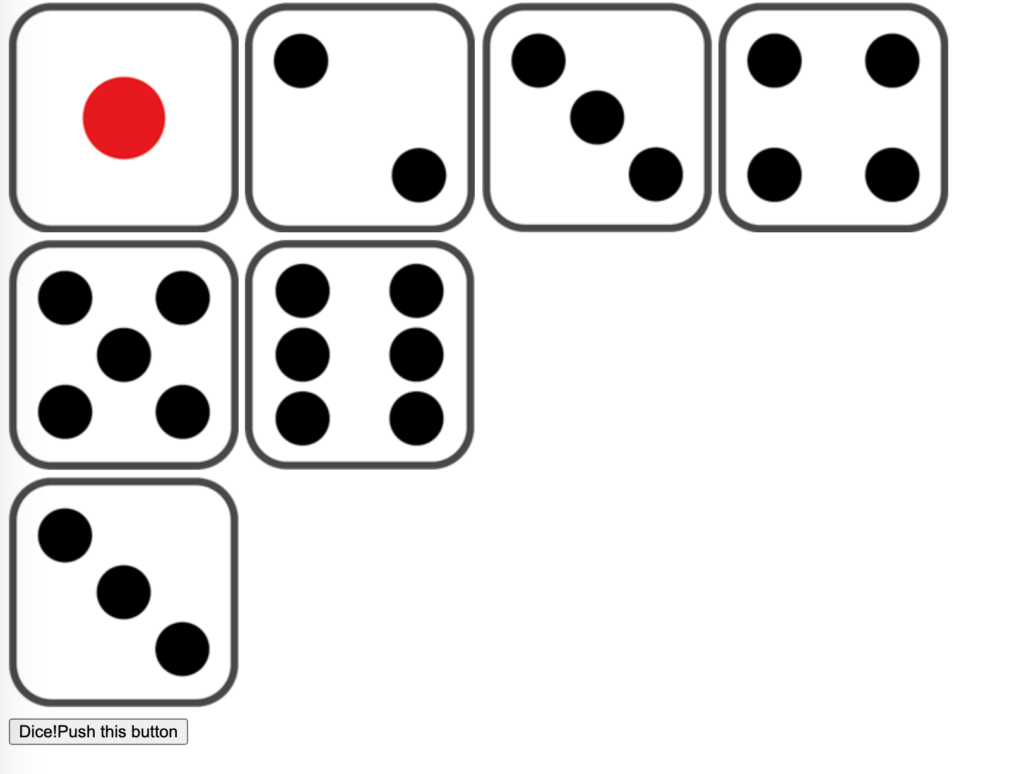
2.以下をダウンロード展開し、中に入っている7枚の画像をimagesフォルダに入れる
作成
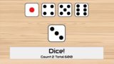
1.index.htmlを以下のように作成する。
<!DOCTYPE html>
<html>
<head>
  <meta charset="utf-8">
  <title>DiceGame</title>
  <!--google web fontの読み込み-->
  <link rel="preconnect" href="https://fonts.gstatic.com">
  <link href="https://fonts.googleapis.com/css2?family=Audiowide&display=swap" rel="stylesheet">
  <link rel="stylesheet" href="css/main.css"/>
</head>
<body>
  <div id="dices">
    <img src="images/dice1.png">
    <img src="images/dice2.png" class="diceHidden">
    <img src="images/dice3.png" class="diceOut">
    <img src="images/dice4.png">
    <img src="images/dice5.png">
    <img src="images/dice6.png">
  </div>
  <div id="dice">
    <img src="images/dice3.png" class="diceIn">
  </div>
  <form>
    <button type="submit">Dice!<span class="result">Count:2 Total:600</span></button>
  </form>
</body>
</html>
今回はgoogle webフォントを使えるようにリンクを入れている。
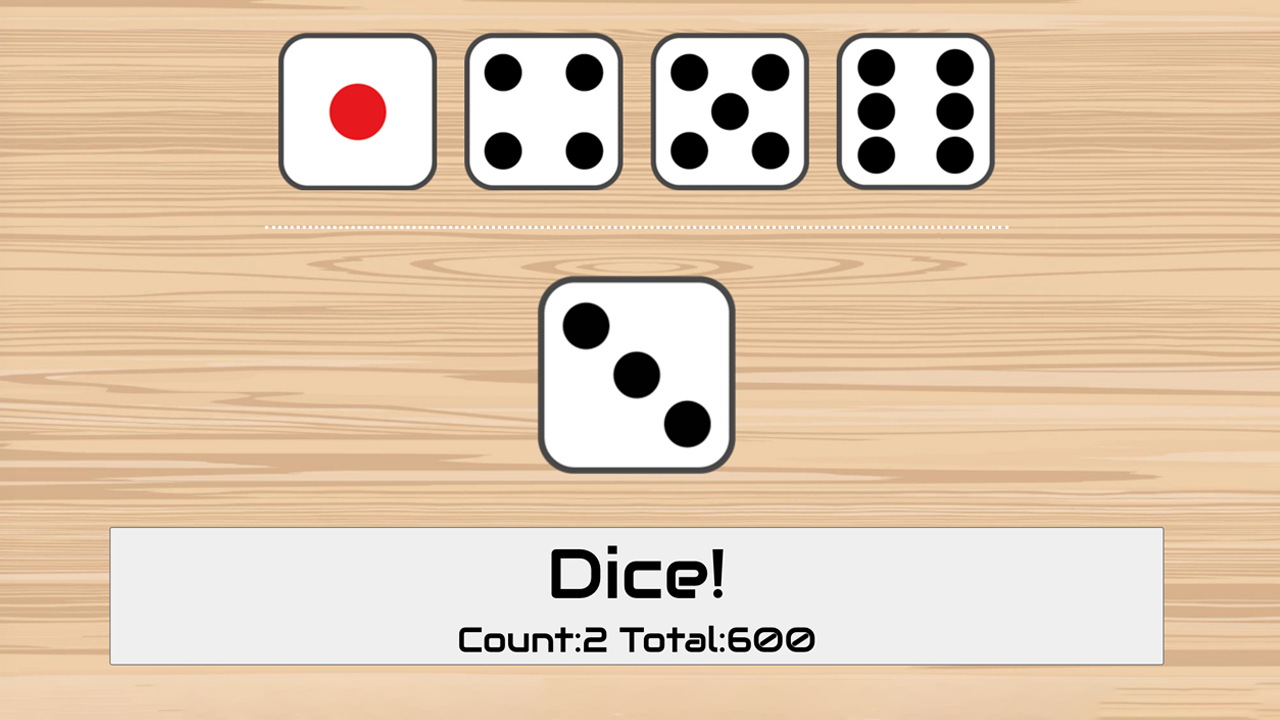
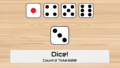
2.実行してみよう。実行しているブラウザ幅によって変わるがだいたい以下のようになれば成功だ
3.スタイルを当てていこう。main.cssを以下のように作成する。
body {
	background: url(../images/bg.jpg) #efcfa9;
	background-size: cover;
	height: 100vh;
	display: flex;
	flex-direction: column;
	justify-content: space-around;
	align-items: center;
}

#dices {
	display: flex;
	justify-content: space-around;
	padding-bottom: 3vh;
	border-bottom: 3px dotted white;
}

#dices img {
	width: 12vw;
	height: 12vw;
	max-width: 170px;
	margin: 2vmin;
}

#dice img {
	opacity: 0;
}

button {
	font-family: 'Audiowide', cursive;
	width: 80vw;
	font-size: 10vmin;
}

button:hover {
	cursor: pointer;
}

button span {
	font-size: 5vmin;
	opacity: 0;
}
.diceHidden {
	display: none;
}

.diceOut {
	animation-name: diceOut;
	animation-delay: 1.5s;
	animation-duration: 2s;
	animation-fill-mode: forwards;
}

@keyframes diceOut {
	to{
		width:  0;
		margin: 0;
		opacity: 0;
	}
}
.diceIn {
	animation-name: diceIn;
	animation-delay: 0.5s;
	animation-duration: 1s;
	animation-fill-mode: forwards;
}

@keyframes diceIn {
	from {
		width:0;
		height: 0;
		opacity: 0;
		transform: rotateX(0);
	}
	to {
		width: 15vw;
		height: 15vw;
		opacity: 1;
		transform: rotateX(360deg);
	}
}
.result {
	display: block;
	animation-name: result;
	animation-delay: 1.5s;
	animation-duration: 1s;
	animation-fill-mode: forwards;
}

@keyframes result {
	from {
		opacity:0;
	}

	to {
		opacity: 1;
	}
}
コメントありバージョン(内容は上と同じ)
body {
	/*背景に画像と背景色を設定*/
	background: url(../images/bg.jpg) #efcfa9;
	/*背景画像で領域を覆うようにする*/
	background-size: cover;
	/*実行している画面の縦幅を高さとする*/
	height: 100vh;
	/*フレックスボックスを使って子要素を並べる*/
	display: flex;
	/*並べる方向は縦*/
	flex-direction: column;
	/*その並べた子要素たちを均等に配置する*/
	justify-content: space-around;
	/*その並べた子要素たちは画面に対して真ん中に並ぶようにする*/
	align-items: center;
}

#dices {
	display: flex;
	justify-content: space-around;
	padding-bottom: 3vh;
	border-bottom: 3px dotted white;
}

#dices img {
	width: 12vw;
	height: 12vw;
	max-width: 170px;
	margin: 2vmin;
}

#dice img {
	/*最初は透明にして見えないようにしておく*/
	opacity: 0;
}

button {
	/*googleフォントの設定*/
	font-family: 'Audiowide', cursive;
	width: 80vw;
	font-size: 10vmin;
}

button:hover {
	/*ボタンにカーソルを載せた時に指マークにする*/
	cursor: pointer;
}

button span {
	font-size: 5vmin;
	opacity: 0;
}
.diceHidden {
	display: none;
}

.diceOut {
	/*diceoutという名のアニメーションを指定*/
	animation-name: diceOut;
	/*そのアニメーションの開始を1.5秒遅らせる*/
	animation-delay: 1.5s;
	/*アニメーションの時間は2秒*/
	animation-duration: 2s;
	/*アニメーションが終わったときの状態を終了後にも保つ*/
	animation-fill-mode: forwards;
}

/*アニメーションの作成(名前はdiceOut)*/
@keyframes diceOut {
	/*toは最後の状態を指定*/
	/*徐々に透明にしながら幅を0にしていくアニメーション*/
	to{
		width:  0;
		margin: 0;
		opacity: 0;
	}
}
.diceIn {
	animation-name: diceIn;
	animation-delay: 0.5s;
	animation-duration: 1s;
	animation-fill-mode: forwards;
}

@keyframes diceIn {
	/*fromは最初の状態を指定*/
	from {
		width:0;
		height: 0;
		opacity: 0;
		/*x軸回転の設定最初は0*/
		transform: rotateX(0);
	}
	to {
		width: 15vw;
		height: 15vw;
		opacity: 1;
		/*最後は360度(1回転)*/
		transform: rotateX(360deg);
	}
}
.result {
	display: block;
	animation-name: result;
	animation-delay: 1.5s;
	animation-duration: 1s;
	animation-fill-mode: forwards;
}

@keyframes result {
	from {
		opacity:0;
	}

	to {
		opacity: 1;
	}
}
基本となるレイアウトはflexboxを利用し画面にうまく収まるように配置している。
今回はCSSアニメーションを使ってダイスの描写に動きを加えている。
3.実行してみよう。
今回3の目が出てそれを削除している様子がわかる(2はすでに削除済み)。ブラウザ幅を変えてみよう。レスポンシブにいい感じに大きさが変わることがわかる。
CSSアニメーションの優良記事
以下の記事が大変よくまとまっているのでCSSアニメーションを利用する際には参考にするとよい。
関連記事
実際にゲームを行うには何かしらのプログラミング言語が必要になります。
以下は各種言語での作成例です。
コメント